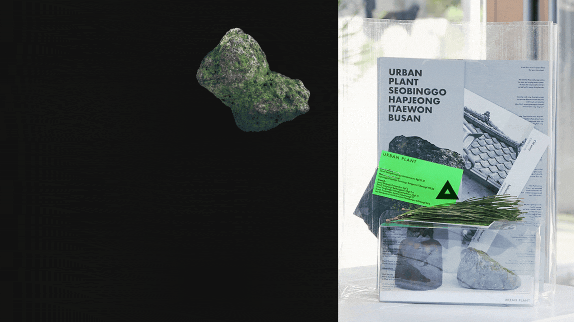
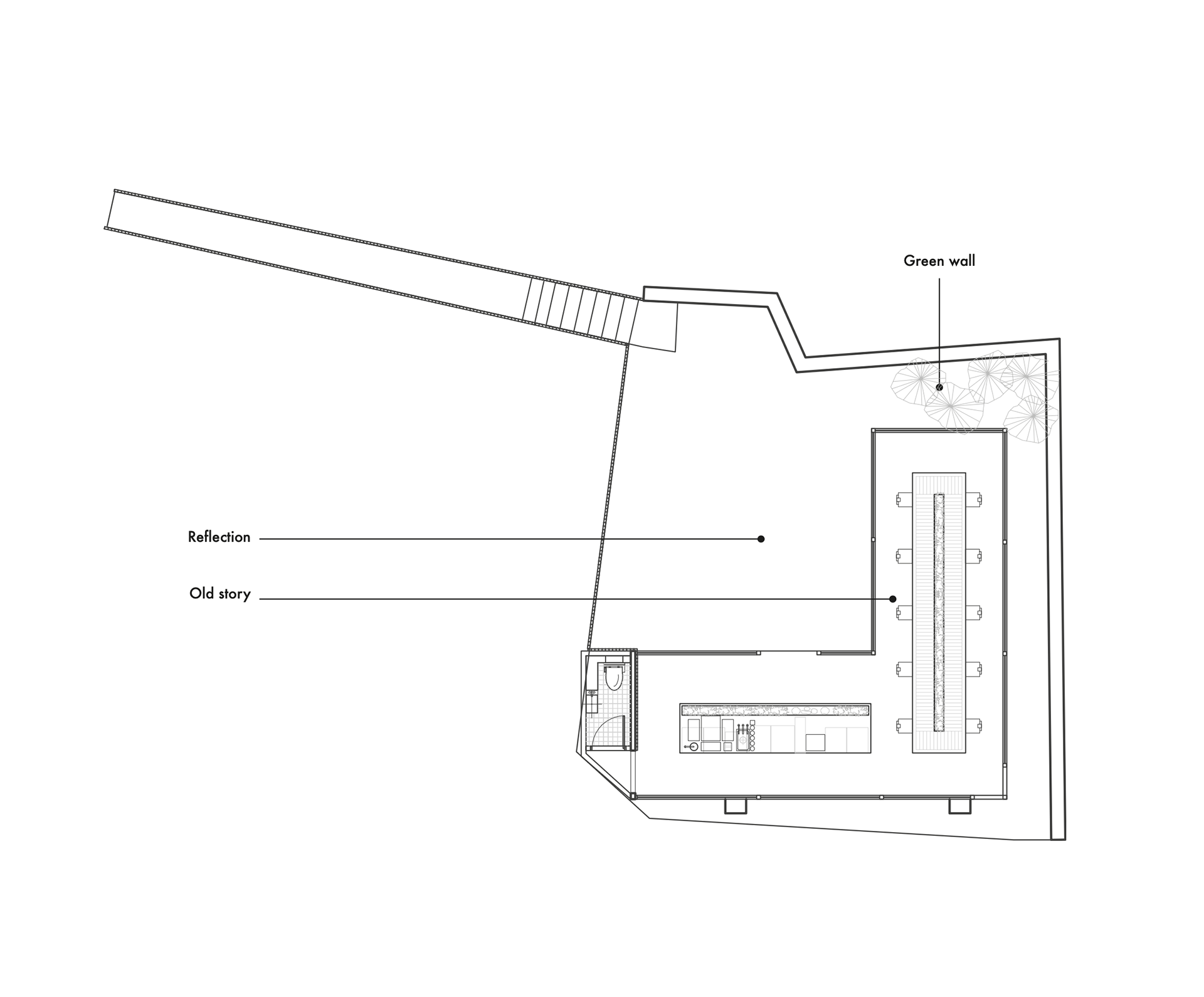
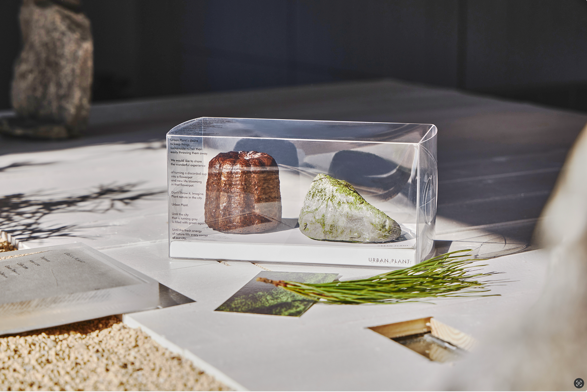
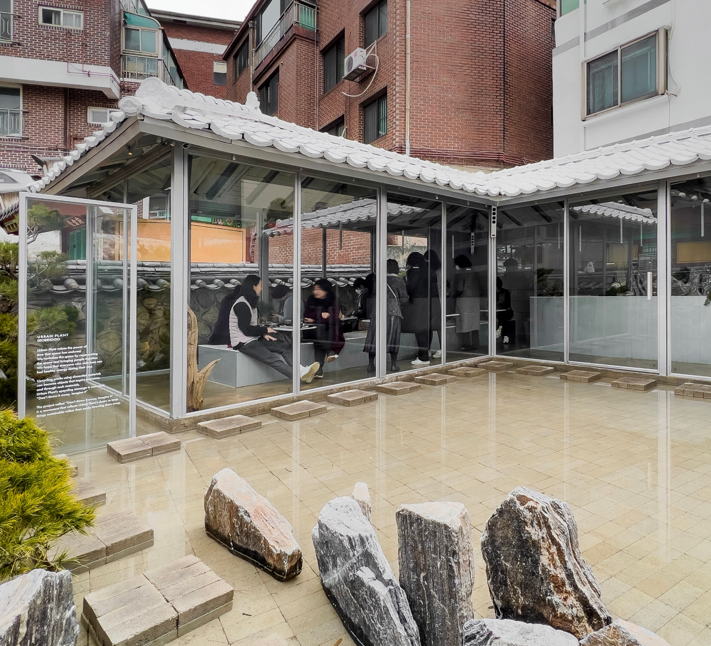
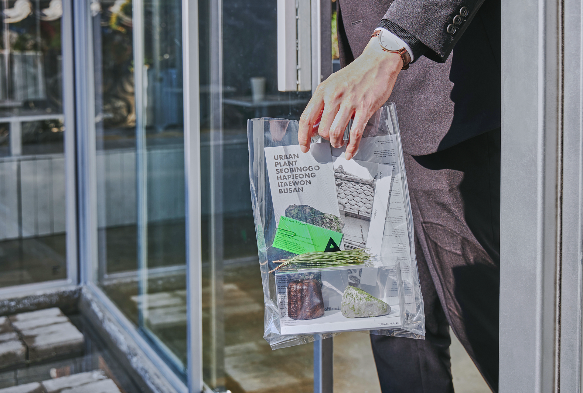
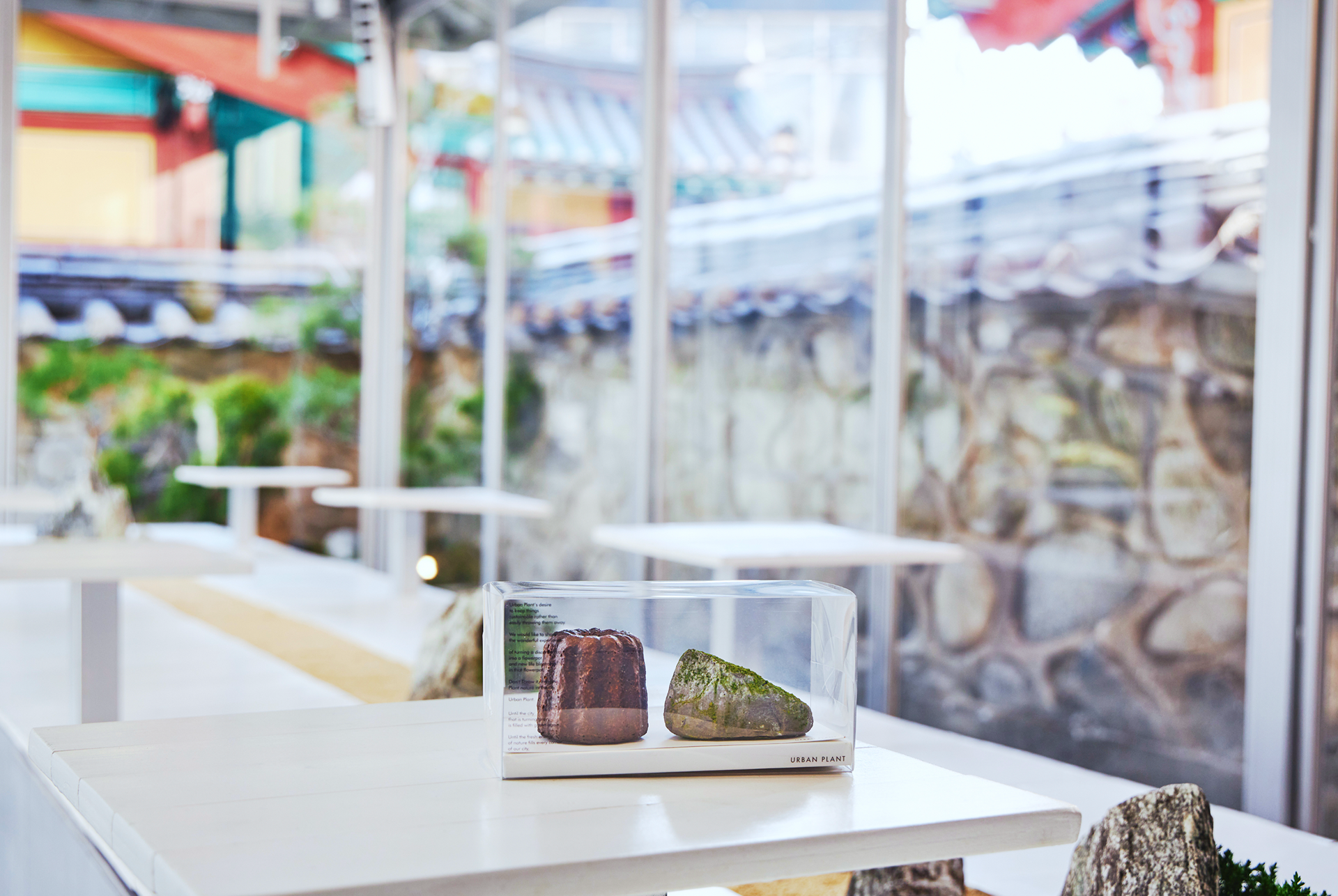
For Cafe Urban Plant, a café that reimagined an old Hanok under the concept of “culture mix art,” I designed dessert packaging, handouts, and menu boards to create a cohesive brand experience. The goal was to make desserts visually appealing and reflective of the café’s interior design while reinforcing the brand’s unique identity.
I emphasized the natural stone shapes of the desserts, using transparent packaging to highlight intricate details, and applied simple typography and clean layouts to let the products stand out. This approach ensured that the visual presentation of the desserts aligned with the café’s overall aesthetic and concept.
The project strengthened the café’s brand identity, enhanced customer engagement with the products, and established a unified visual experience across all packaging and promotional materials, guiding customers through a visually immersive and memorable brand journey.
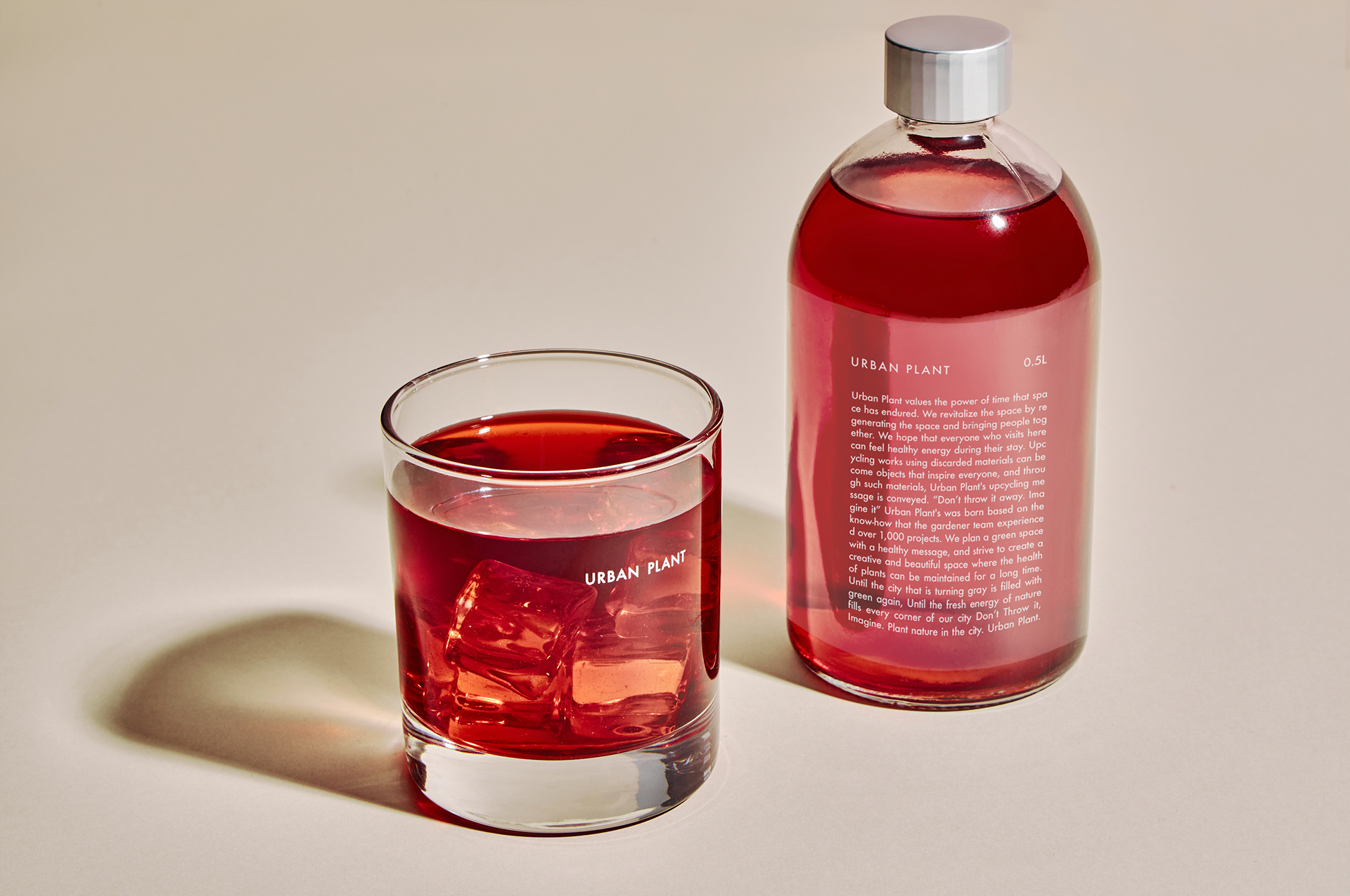
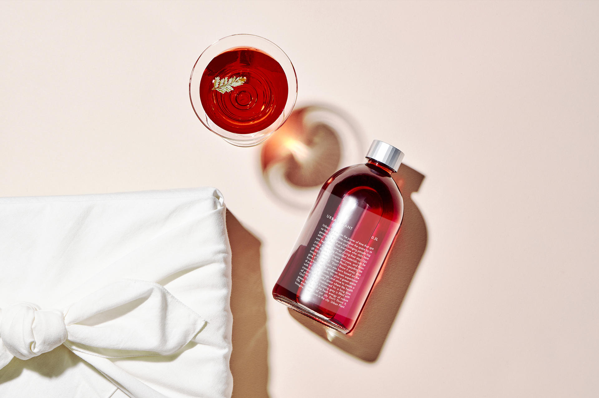
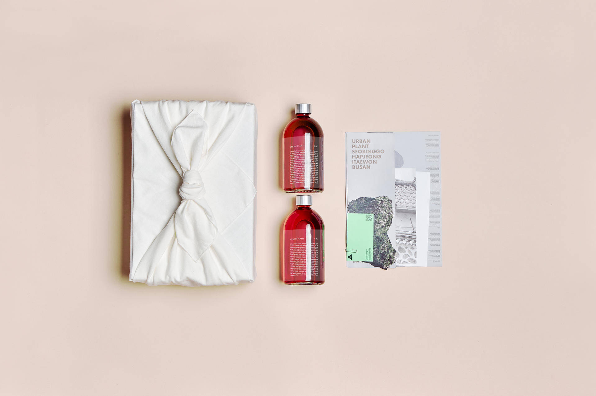
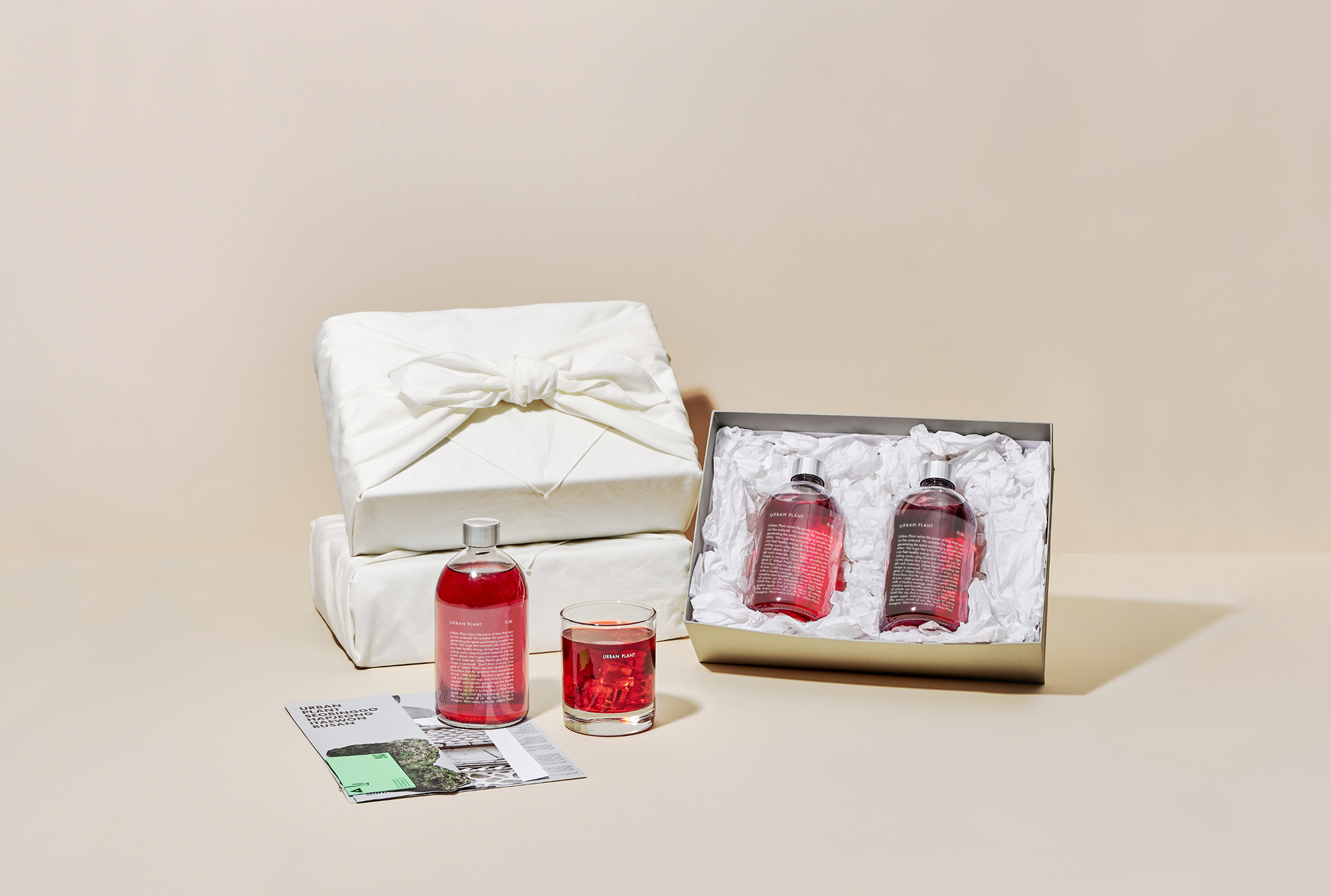
For Cafe Urban Plant’s Sangria-inspired beverage line, I designed bottle packaging that emphasized the vibrant colors of the drink while creating an engaging customer experience. The goal was to reflect the café’s brand philosophy and make the product visually stand out on shelves.
I used a transparent and minimalist design approach to highlight the beverage’s unique appearance, while ensuring consistency with the café’s overall brand identity. This design reinforced the brand’s visual language, attracted customer attention, and enhanced the perceived value and appeal of the product.